RAW – Part 2 By: Max Foster
Go to RAW Part 1
Camera Calibration & Saturation
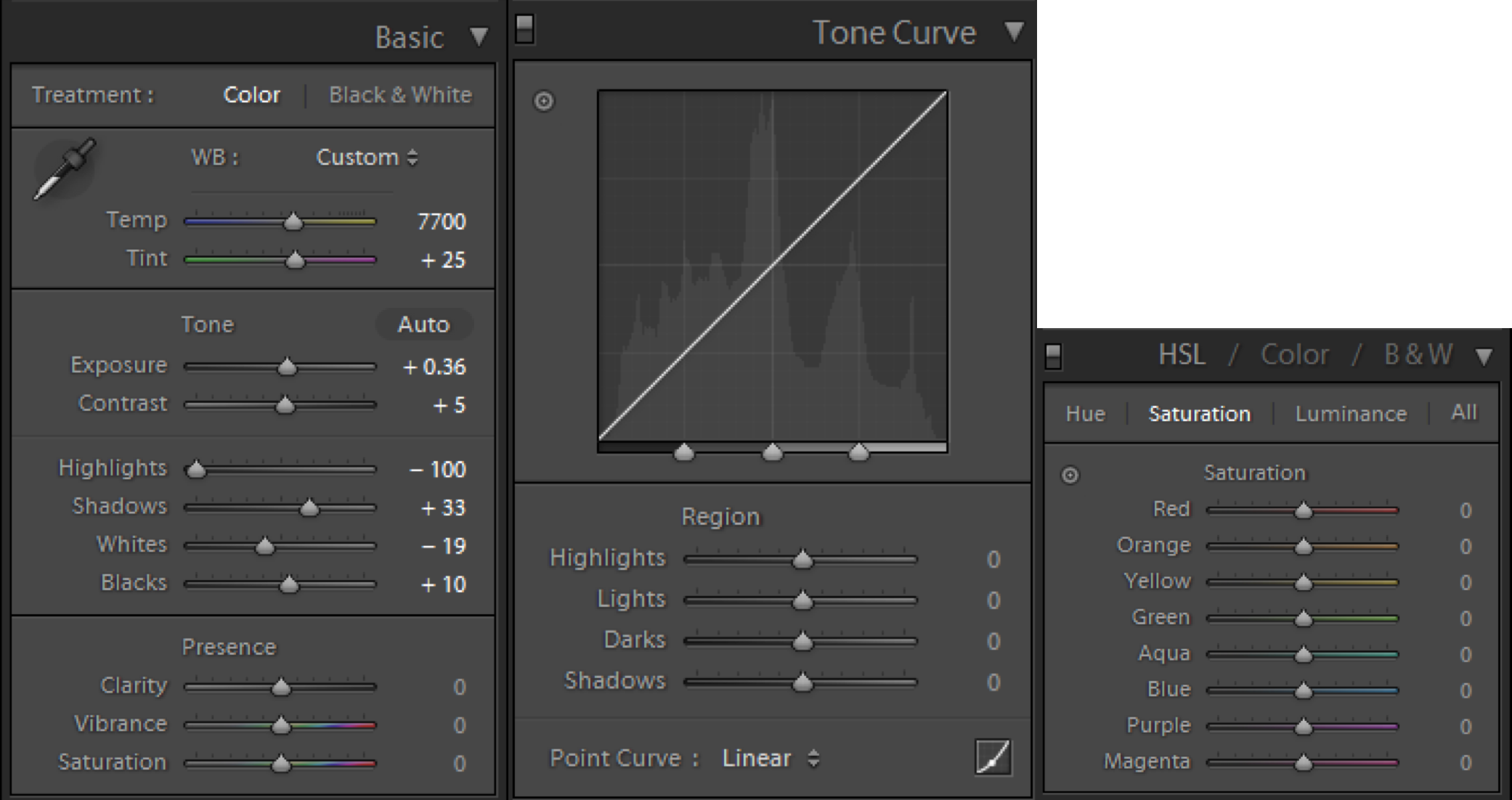
One of the best kept secrets in Lightroom and ACR is the Camera Calibration module. This module has several standard profiles that Adobe has preloaded, and it also allows you to create your own profiles and save them. Essentially, these profiles are how Lightroom interprets the color information from your camera. By default, the Adobe Standard profile is selected and I always leave that selected. Each photo is different, so I am not an advocate of creating profiles and presets unless you have several similar images you are processing.
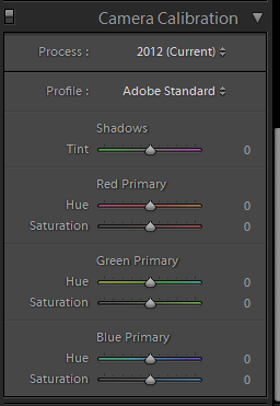
The sliders below the profile menu are some of the most useful tools in the RAW process. I typically avoid the shadows slider and focus entirely on the red, green and blue primary sliders. One of the first things I like to do when I finish with the distortion and file correction issues is move to this module and add some color and pop to the image. The camera calibration module is one of the best ways to add saturation and pop to an image without making it look garish and overly saturated. When you are working in this module, there are a few things to keep in mind. If your photo has a dominant color, such as a lot of blue sky, then you will likely want to avoid using the blue slider. When you increase the slider that matches the dominant color in a scene, it can easily push it over the top. Also, don’t be afraid to push these up to 70-100 if your photo is washed out to begin with. Below you will see a few before and after photos, with the only adjustment being the saturation slider in this module:

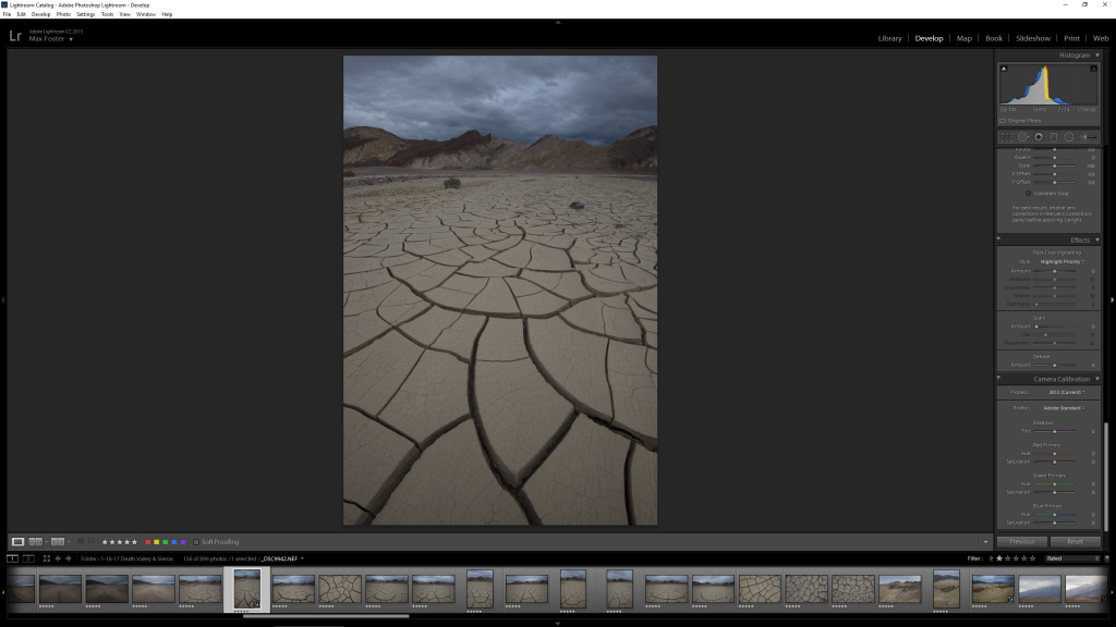
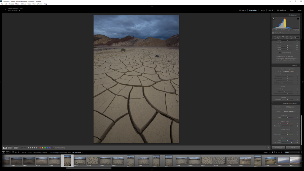
As you can see, even with absolutely no other image adjustments, these sliders start to bring out the true colors of these images. When my images are not dominated by blue, I find the blue slider to be the most effective and oftentimes will push this all the way to 100. If you start to see any fringing or loss of detail in smooth areas, then you will want to back the slider down. Each color primary also has a hue slider. This is typically something I use sparingly, as it can drastically alter the hue with just a small adjustment. However, if you find that the blue sky or other feature needs to be adjusted, you can do that here. I prefer to do that in the H/S/L module as it can be more targeted.
I recommend making adjustments within the Camera Calibration module at the front end of the workflow. If you get too far into the edit with contrast and saturation adjustments first, it can be difficult to dial this in. Not all images need a huge adjustment here, but most will show a significant benefit.
Global Adjustments
Global adjustments are applied to the entire image. The adjustments may only adjust certain tones or colors in the image, but they are applied throughout the image. The primary modules for global adjustments are the Basic, Tone Curve, and H/S/L modules. We will also touch on Split Toning in the next section.
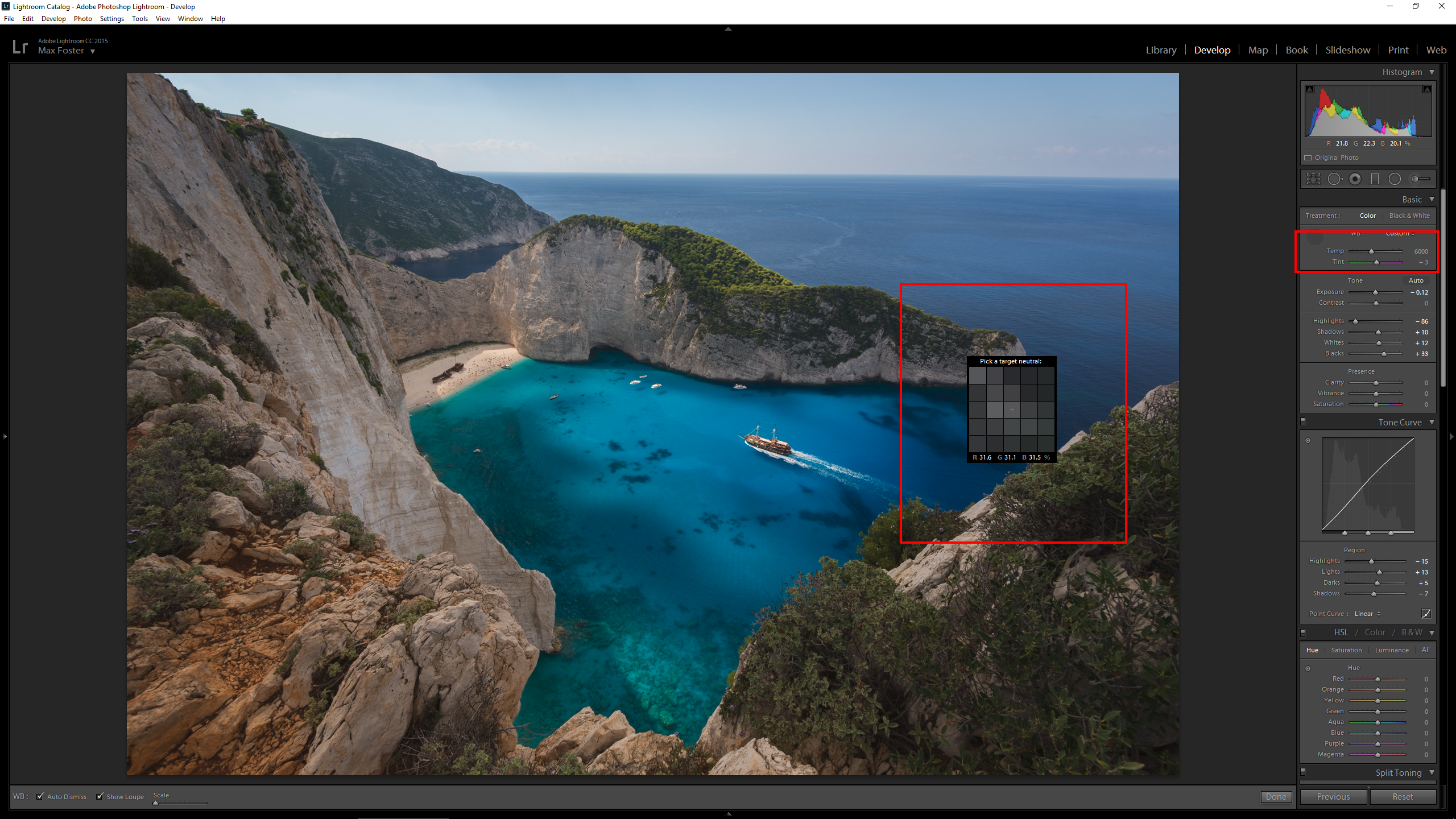
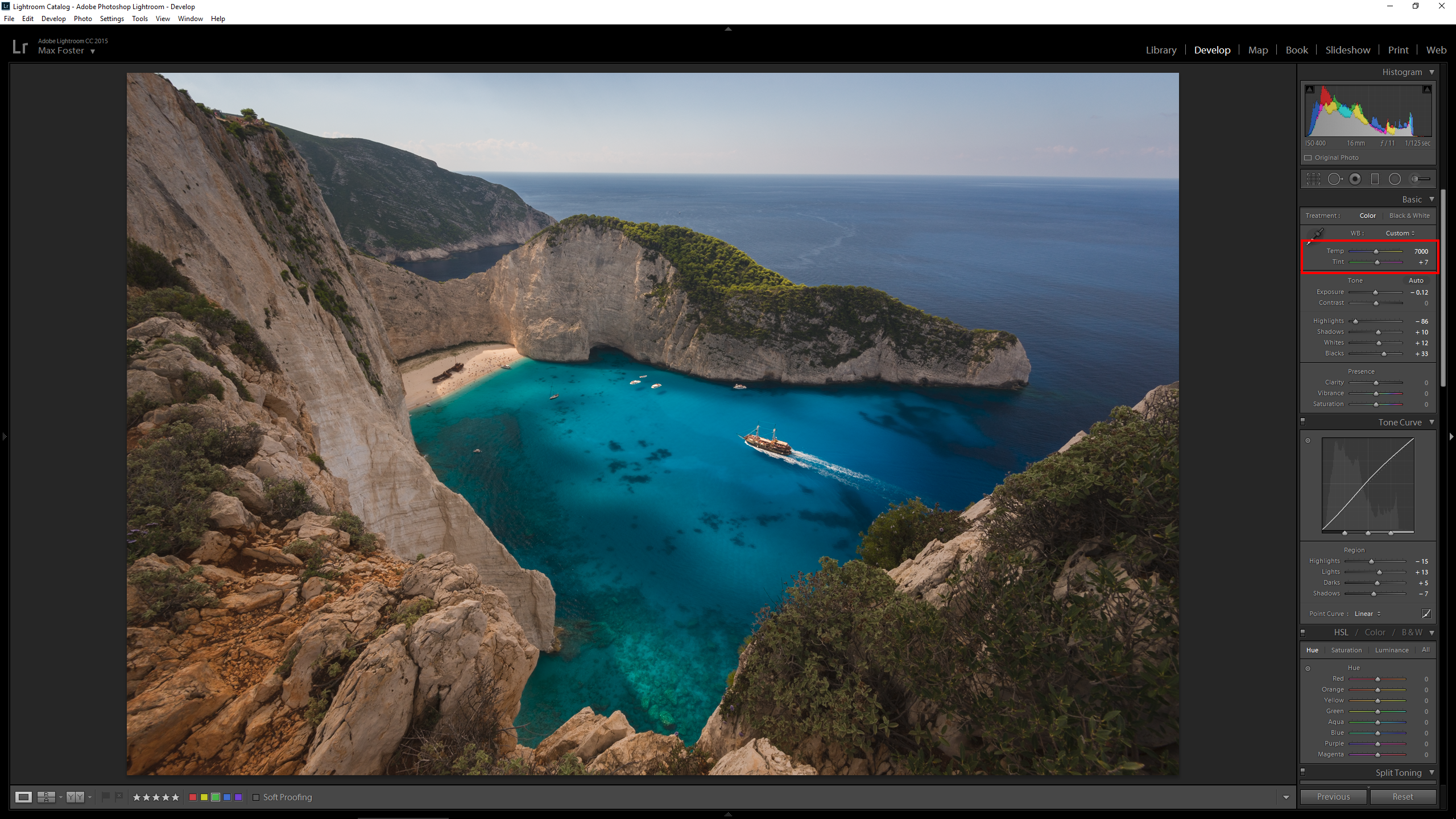
To begin, I like to adjust the white balance and tint. These sliders can really direct the overall direction of the editing later on, and are very taste specific. You can go many directions with this, starting at a neutral white balance. I like to experiment with different combinations, and later on in the targeted adjustments section I will show you how to increase color contrast with these sliders.
If you are looking for a neutral starting point, you can use the white balance selector tool. Click on an area in the image that should be a neutral gray color, and this should properly set the white balance. If you pick an area other than gray the results can be pretty drastic, but it is easy to undo. In the images below, the white balance selector tool increased the temperature by +1,000 and the tint moved toward magenta by +4. This warmed up the cliffs nicely and removed some of the inherent color cast of the scene.
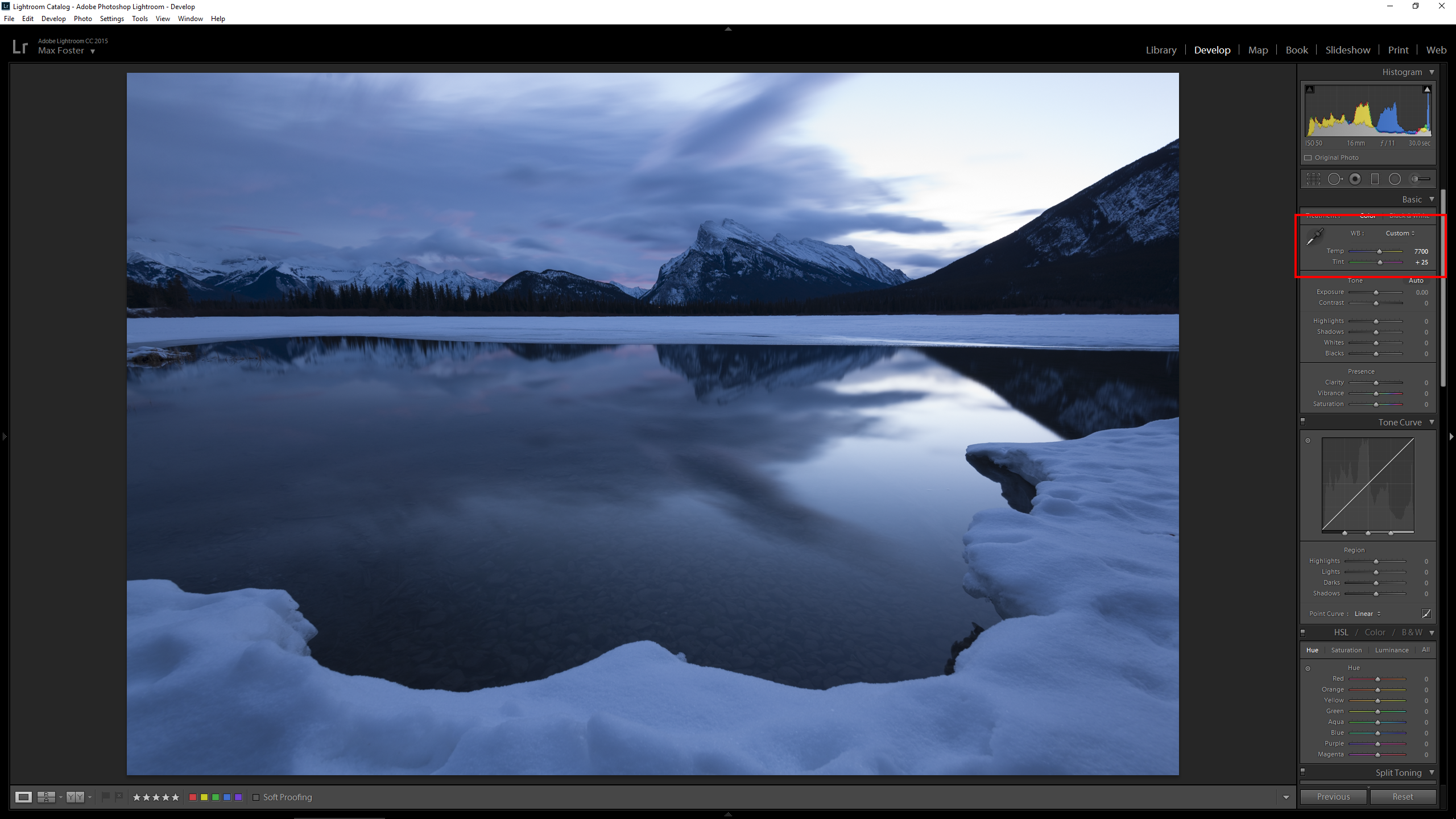
I usually do not use the selector tool, however, and adjust these by hand. Many images taken during blue hour will be very blue and need to be warmed up. On the other hand, some images with the sun low on the horizon can be dominated by warm temperature light. The best thing to do here is practice adjusting the sliders using different combinations of temperature and tint until you find the best combination. The image below has a very cool temperature and slight green tint. I found that by warming it up +350 removed some of the blue cast. I also increased magenta tint by +7 as this created a much more pleasing color palette to work from. When working on a low light photo, it is important to check the shadows and darks in an image for any overly dominant color cast (typically blue).

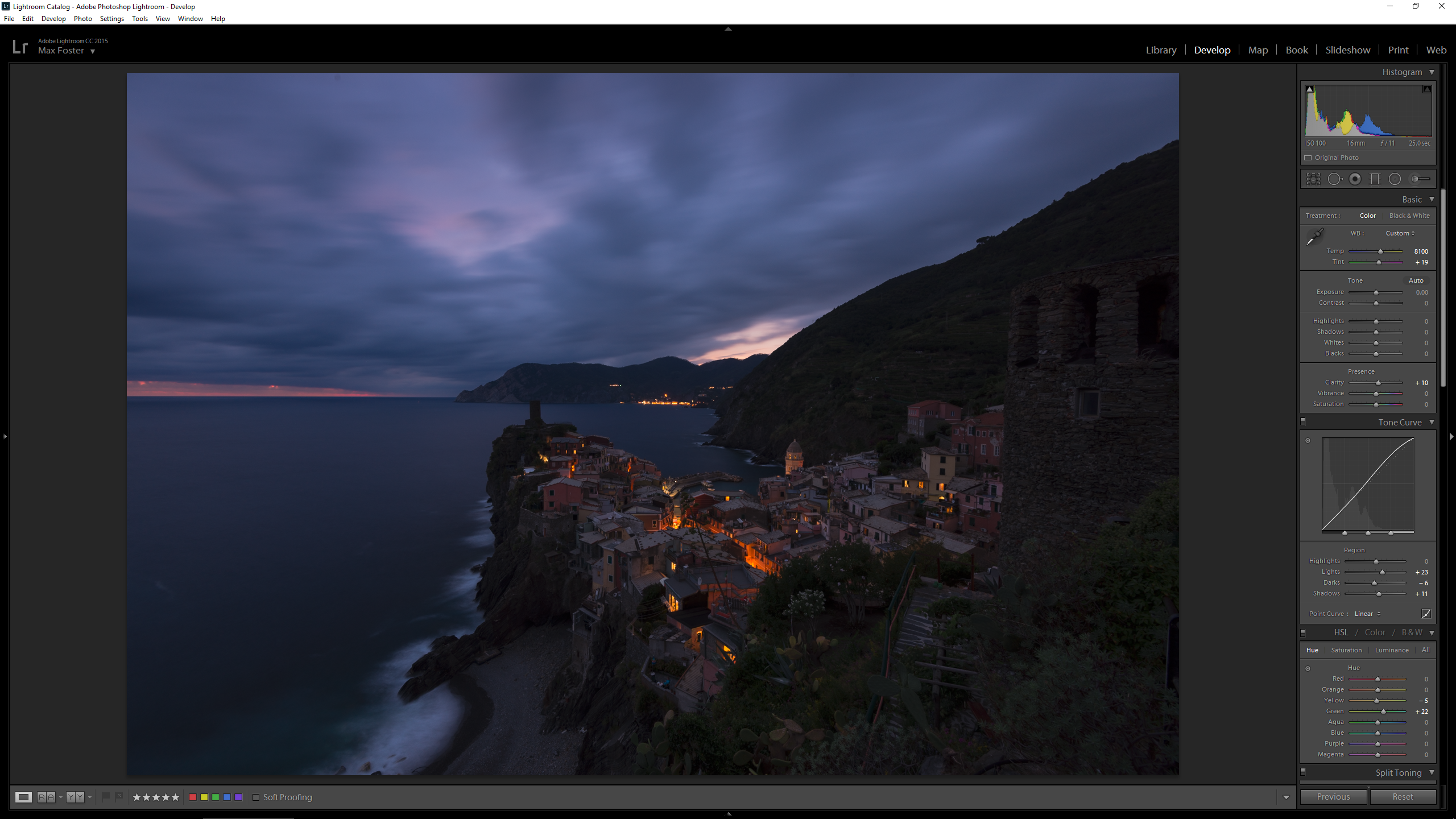
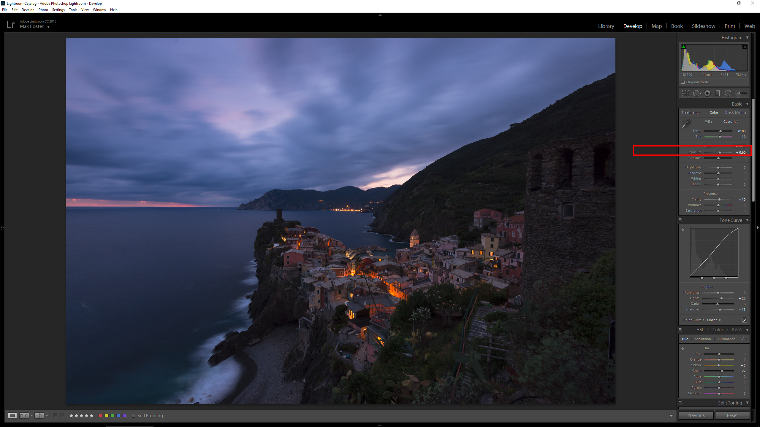
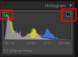
After adjusting the white balance and tint, I like to move on to the basic tone sliders. The exposure slider is usually a good place to start. If I underexposed an image to retain highlight detail, for example, then I will bump my exposure up until the majority of the image is exposed properly. For me, this usually means that all areas in the image have some amount of detail (not pure black or white), and the left side of the histogram is not pushed up against the edge. I like to bring out as much detail as possible in Lightroom, as I can always darken things in Photoshop if necessary. If you bring the image into Photoshop and it is too dark, it becomes more difficult to cleanly bring out details. The exposure slider can quickly blow out highlights or crush shadows, but this may be necessary for the time being. We have two ways to balance that out later on (targeted adjustments and double processing). As you can see below, the image is very dark and was exposed for the bright city lights. I bumped the exposure up by +0.60 to account for this.
The contrast slider can be useful on images that do not inherently have a lot of contrast, but for high contrast scenes I typically avoid it. I much prefer to control the contrast with the highlights, shadows, whites, blacks (HSWB) and tone curve sliders. These sliders allow you to control what areas of the image have contrast added or removed. However, if an image has too much heavy contrast it can actually be useful to decrease the contrast slider to bring out more detail before moving on to the other sliders.
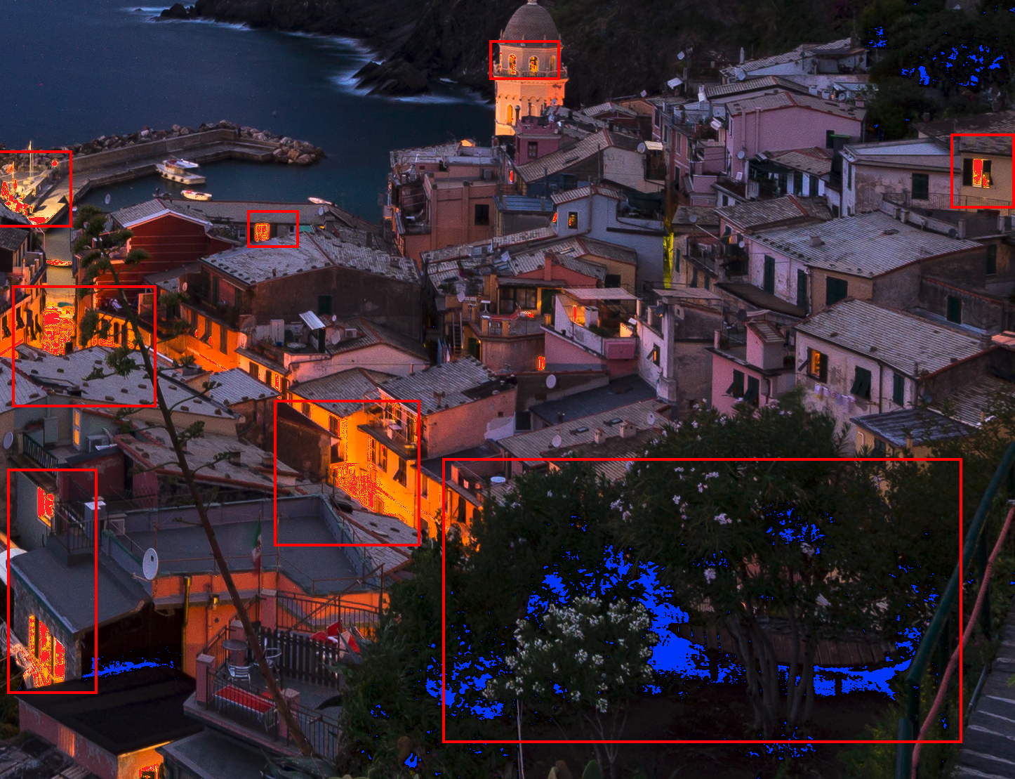
 Much like white balance and tint, I think the best course of action with the HSWB sliders is to experiment with images to bring out the best details and retain a high level of image quality. When adjusting these, I think it is very important to turn on the shadow and highlight clipping notifications. It can be very easy to add contrast to a scene and at first glance it may look good. However, when you zoom into 100% view, you may see areas that have lost detail due to this. If you turn on the notifications, then you can easily identify areas that may clip, and avoid this.
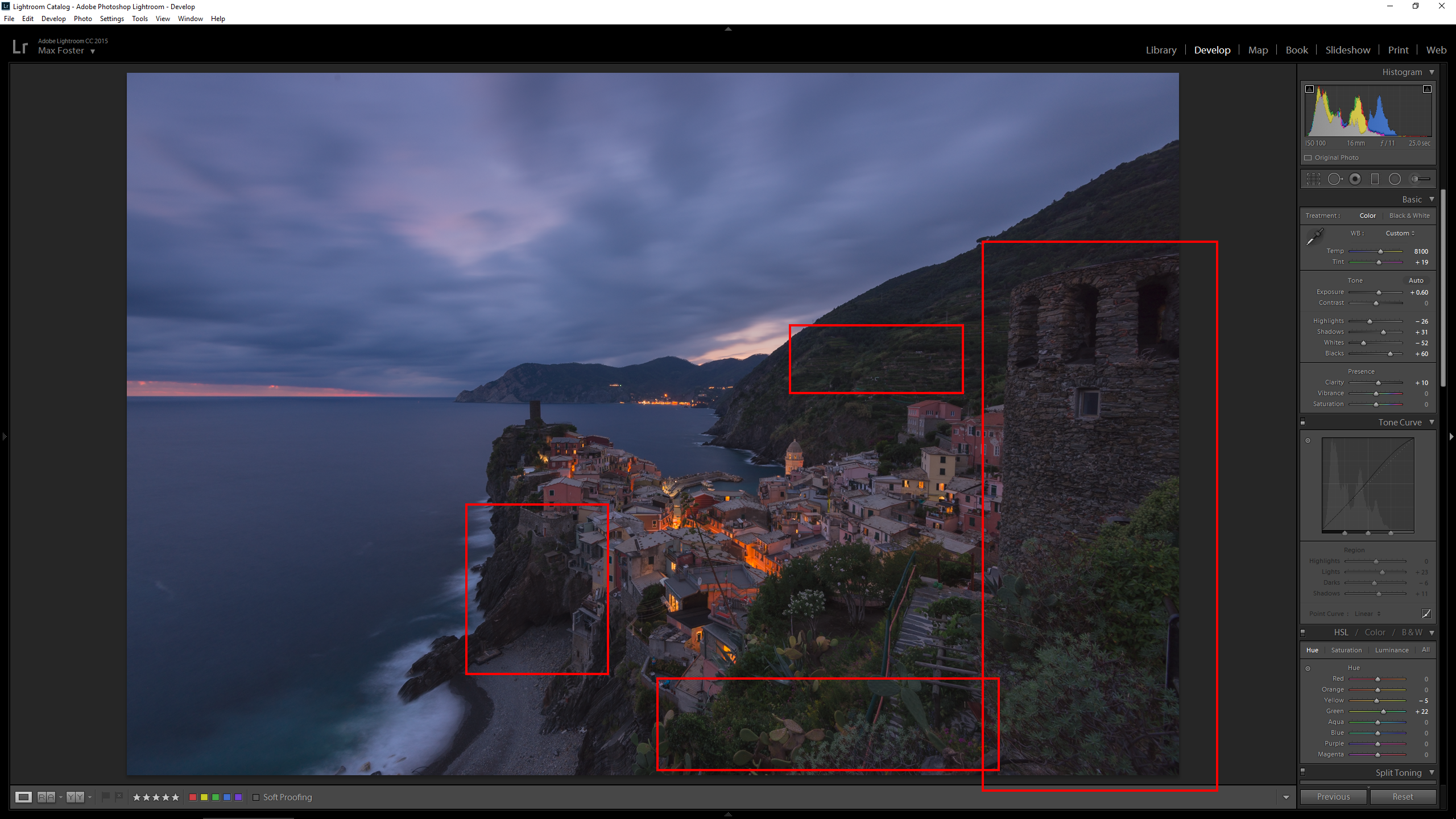
Contrast is another taste specific adjustment. There may not be any right or wrong way to add contrast, but if high image quality is important to you then you will want to add it carefully. I do not push things too far in Lightroom, as it is possible to add contrast in more controlled manner in Photoshop. In fact, I often reduce overall contrast in Lightroom in order to make all the image details visible, and then add contrast back in where I want it later in Photoshop. With the image below, I left the contrast slider at 0, and then effectively reduced the contrast of the image by decreasing the highlights and whites and increasing the shadows and blacks. You can see how much detail that came out by doing this.

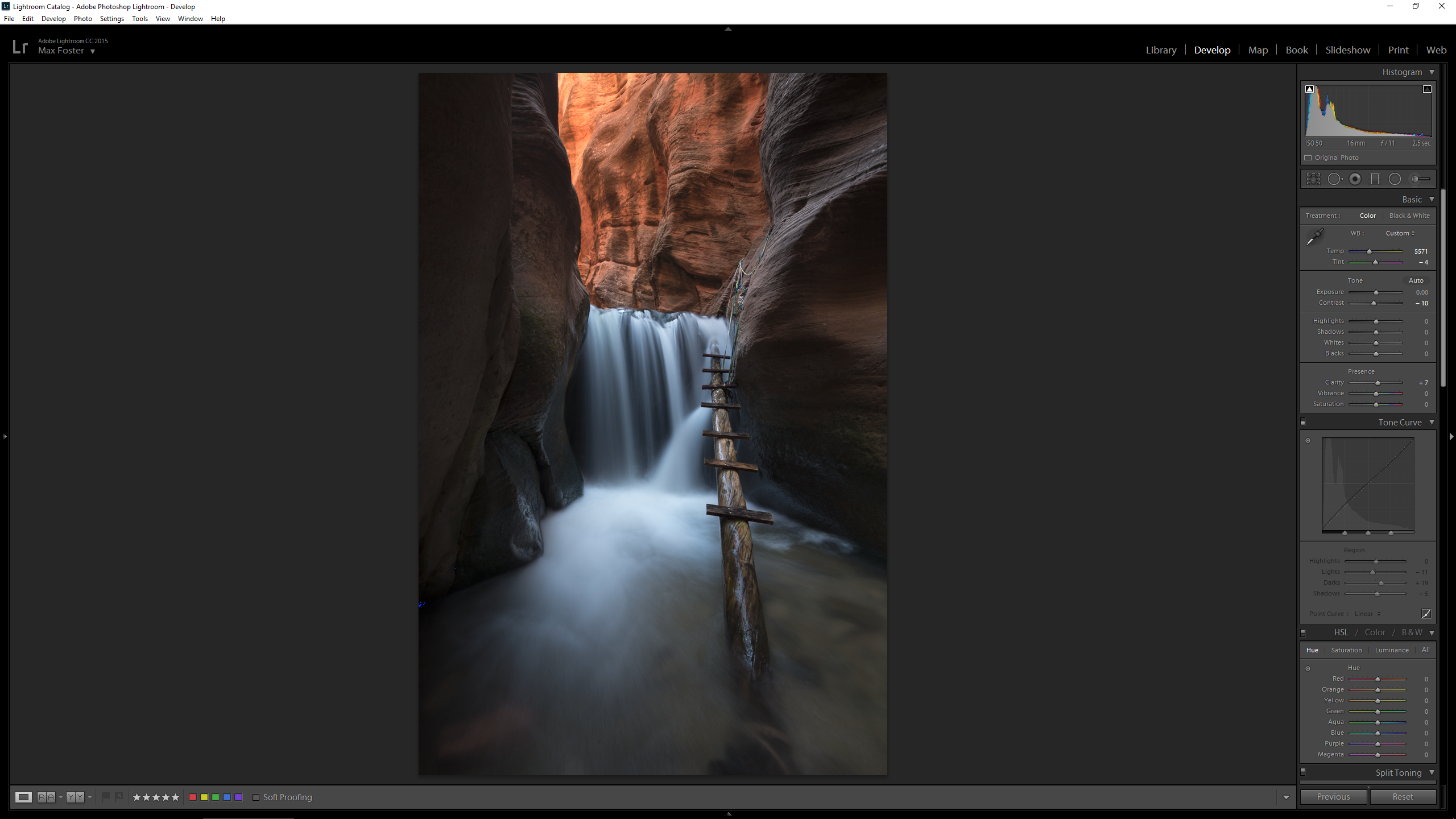
Below is another example of an image that I reduced the contrast of before bringing into Photoshop. This is very useful when you want to control exactly where and how much contrast to add. At first, this may seem as though the image is losing some punch. However, if you add a lot of contrast in Lightroom, and then want to refine it in Photoshop, you may end up losing shadow and highlight detail.
Another very useful tool for globally adjusting the image is the tone curve module. At the top of the module, you will see a histogram and the line for adjusting the curve. There are many ways to adjust this curve; you can simply slide the sliders left or right, you can use the selector tool to click on your image and adjust that exact tonal range and you can also click and drag up or down on the tone curve itself. Each of these methods accomplishes the same thing, so it really comes down to what you like best.
The sliders in the tone curve module are similar to the basic sliders above. However, in place of whites/blacks sliders there are lights/darks sliders. Since you can pick exact tonal points on the image to adjust on the curve, this is a more refined way to adjust the tonal values of the image. You can also add contrast without impacting the black point of the image, which is very useful. In the bottom right of the module, there is an icon to switch from the region curve to the rgb curve. I typically only use the region curve, as I like to adjust individual color channels in the HSL module or later on in Photoshop. In the image below, you can see that by increasing the highlights/lights sliders and decreasing the darks/shadows sliders I was able to add a nice amount of contrast without clipping any areas.
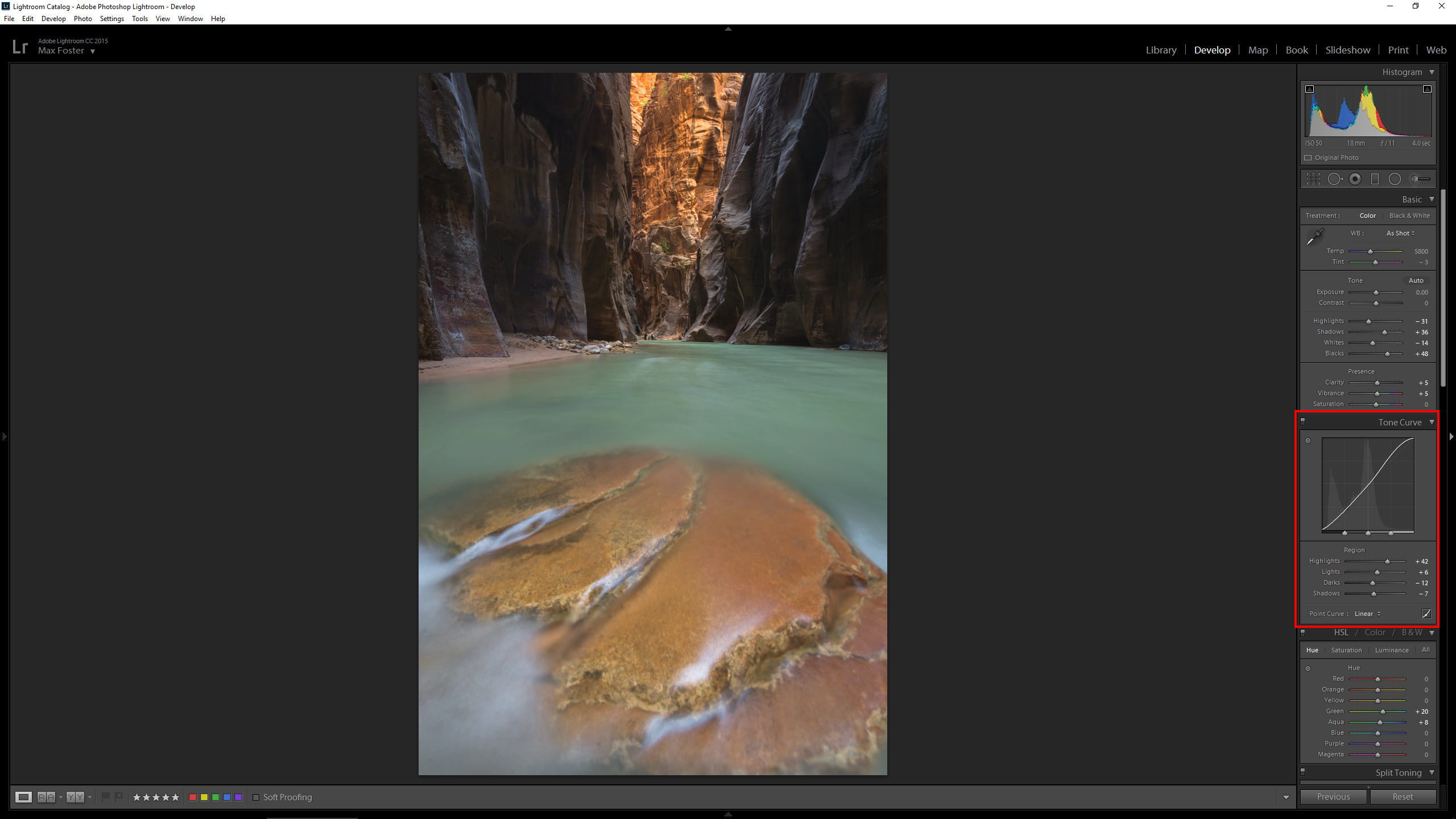
Another nice aspect of the tone curve module is that it can push the basic adjustments even further. For example, if you were trying to bring the up shadows of a particularly dark image and the basic shadows slider maxed out at +100, you could then also increase the shadows in the tone curve module. With the incredible sensors in cameras today, this is not an unreasonable scenario.
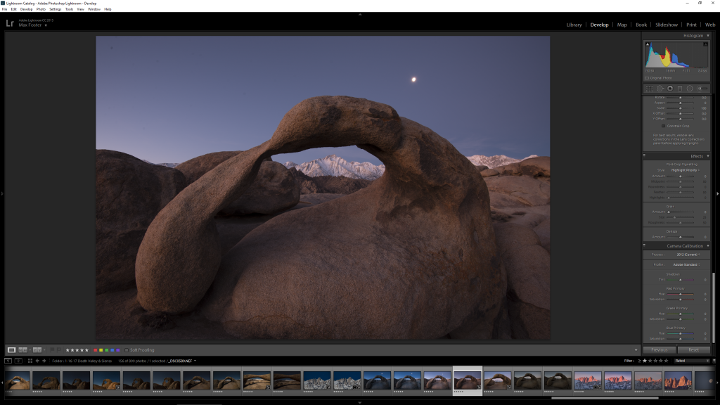
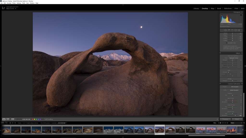
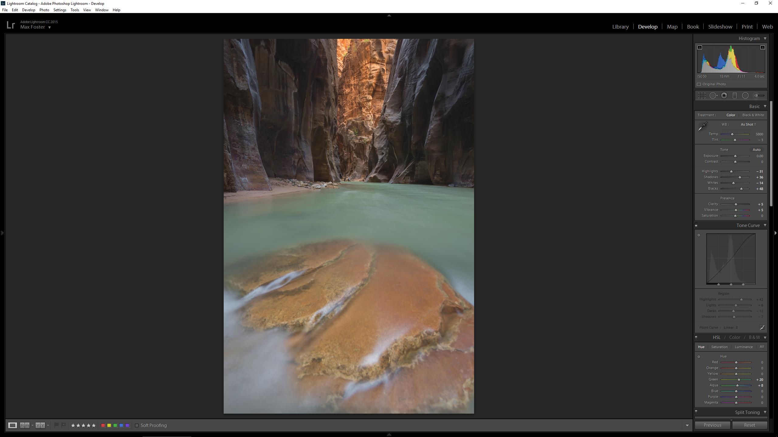
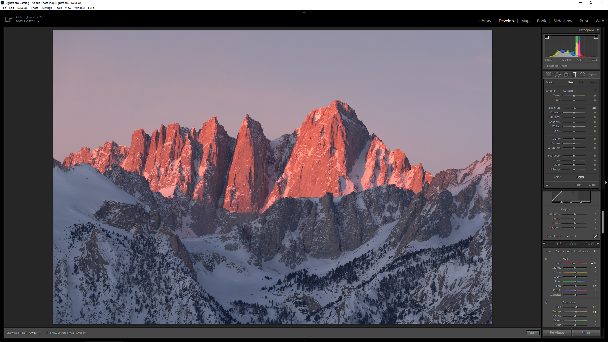
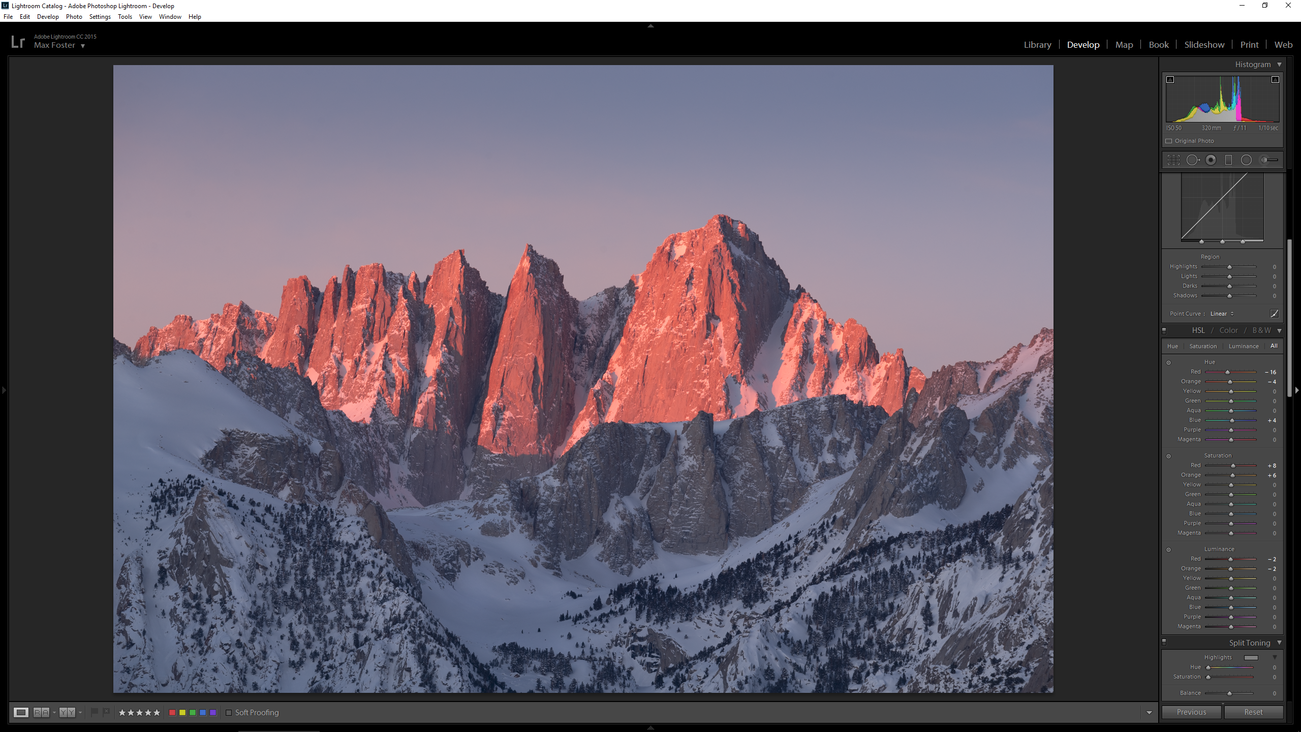
The final module we will look at in the general global adjustments section is the HSL/Color/B&W module. We will be focusing on the HSL section exclusively. This module is a fantastic way to quickly adjust the colors in an image. There are many great resources on the internet today that explain color theory, harmonious color palettes and more, so we are going to focus more on how this module works. When HSL is selected, there are three subsections below: hue, saturation and luminance. Each of these has sliders with eight color scales for adjustment. These color sliders represent the colors in any particular image. For example, if I have an image with a blue sky, the sliders that will impact the sky would be blue and aqua. I could move the red slider, but it wouldn’t do anything to the image, as there is no red in the sky. Sometimes, I find that I don’t want to adjust any of these in an image, as the colors look perfect the way they are. However, oftentimes I will want to intensify a color, create color contrast or adjust the brightness. In the example below, you can see that the mountain peaks are being front lit with morning alpenglow. The color of the alpenglow out of the camera was a bit too orange.

In order to adjust only the alpenglow, I need to identify what colors make up that portion of the image. I can guess, or I can use the selector tool and click directly on the image. The color mix turns out to be red and orange, so by dragging these sliders to the left I can add more red to these colors and remove the orange. I also want to intensify those same colors, so I can drag the red and orange sliders under the saturation header to the right. Finally, I want to reduce the luminosity of these colors so they do not start to wash out. I can drag the red and orange sliders under the luminance header to the left to do this. As you see below, this added a nice pop to the peaks without impacting the other colors of the image.
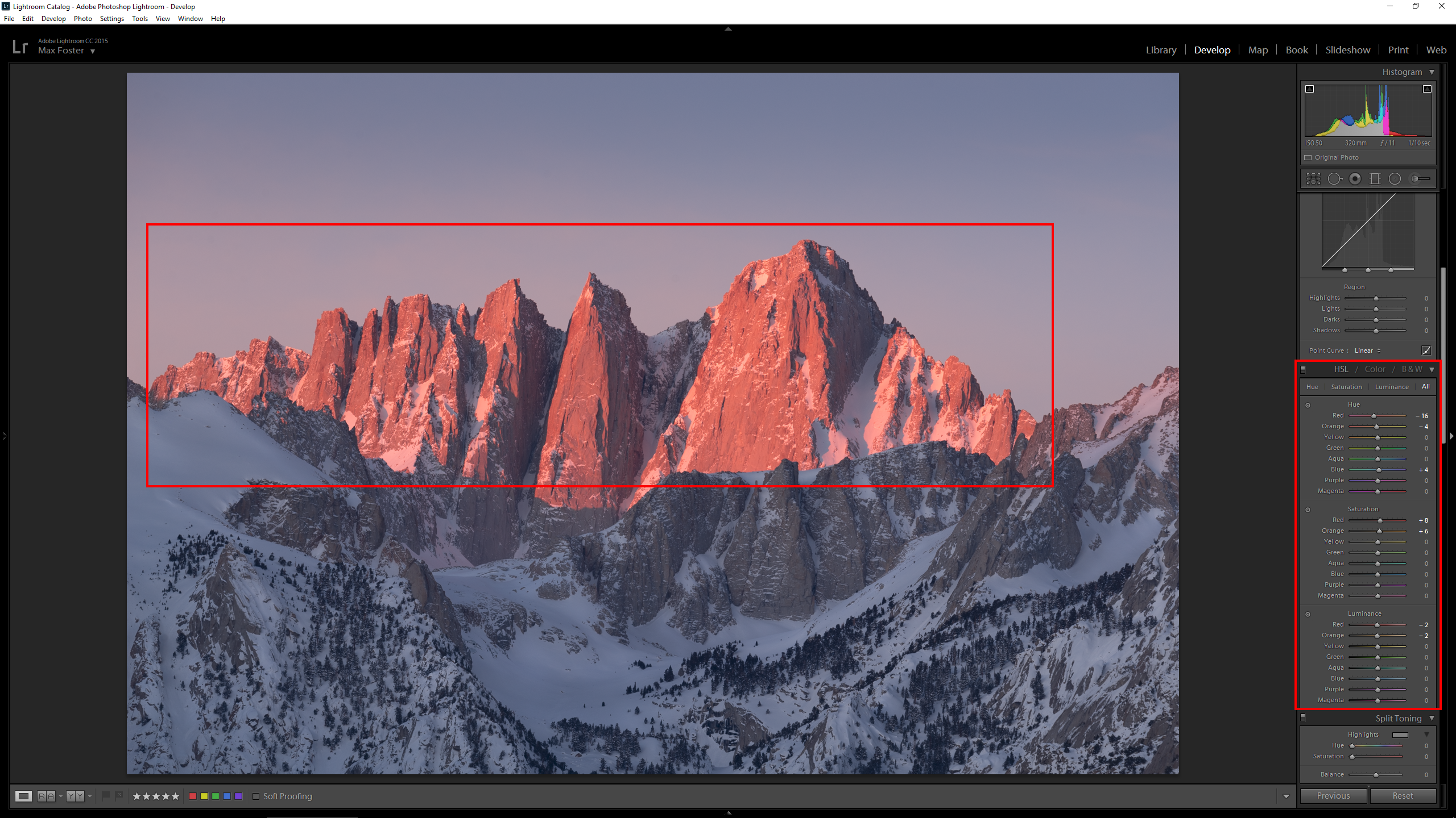
As with contrast, adjust these carefully. If you push the HSL of a specific color too far, it can create nasty image degradation and banding. When used sparingly, it can be very effective in separating colors to create color contrast.
Targeted Adjustments (Brush, Gradients, Elliptical)
After making the global adjustments to an image, it is time to start shaping the scene to your taste. Targeted adjustments in Lightroom are an excellent way to highlight fine details, add color or tonal contrast and help focus the viewer’s eye on the important areas of an image. The three main tools in this category are the graduated filter, radial filter and the adjustment brush. Each of these tools have the same menu options to select from, but they are applied differently.
With the image below, you can see that the luminosity of the outer edges are approximately the same as the inner areas of the image. I want to focus the viewer’s attention to the peaks, and an effective way to do this is to darken the edges slightly with the graduated filter.
I pick the graduated filter and decrease the exposure by -0.19. I also want to create some color contrast, so I cool off the white balance temperature by -11. I want the gradient to be very smooth and soft, so I first click at the very top of the image and then drag down almost to the halfway point. As you see with the red mask below, the gradient is very gradual. If I needed a more abrupt gradient (perhaps to darken the sky above a seascape) I would shorten the space between the three lines representing the gradient mask.
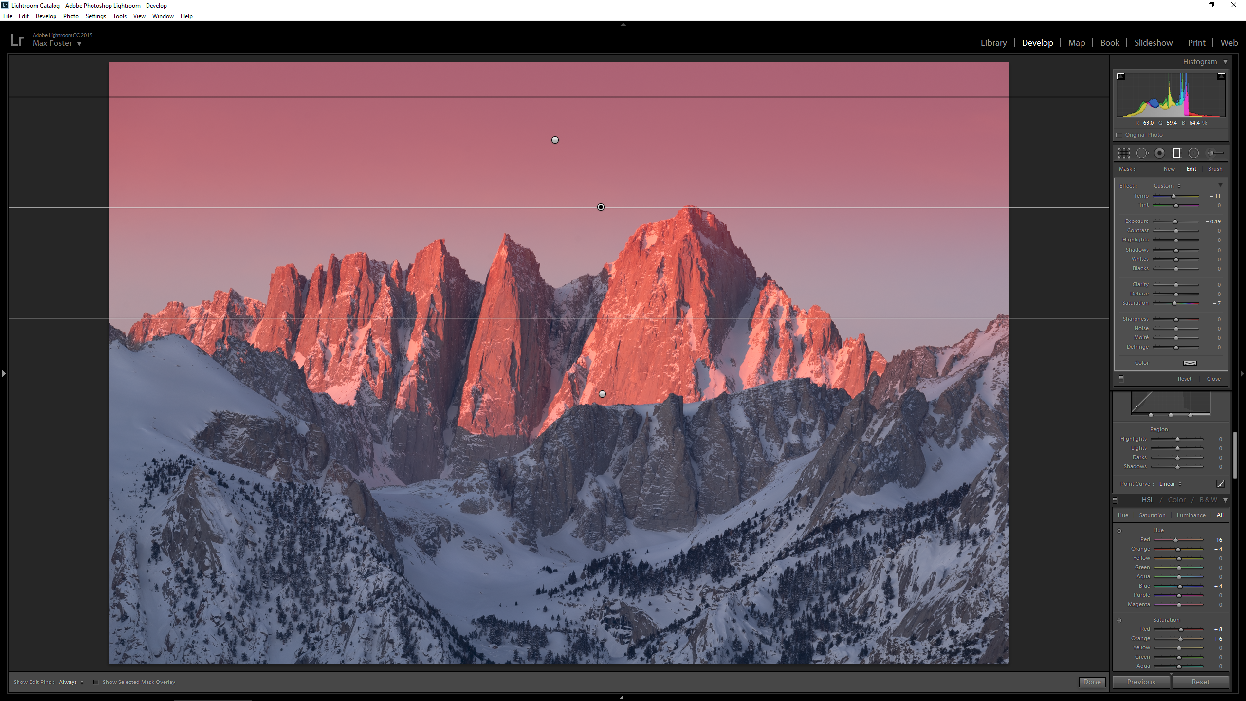
After this, I repeat the same mask one more time with a slightly shorter span to create an even darker sky at the top of the image. I also create another gradient at the bottom of the image with the whites decreased by -25 in order to decrease only the brightness of the snow, not the dark trees. These three gradients create a very nice vignette effect.
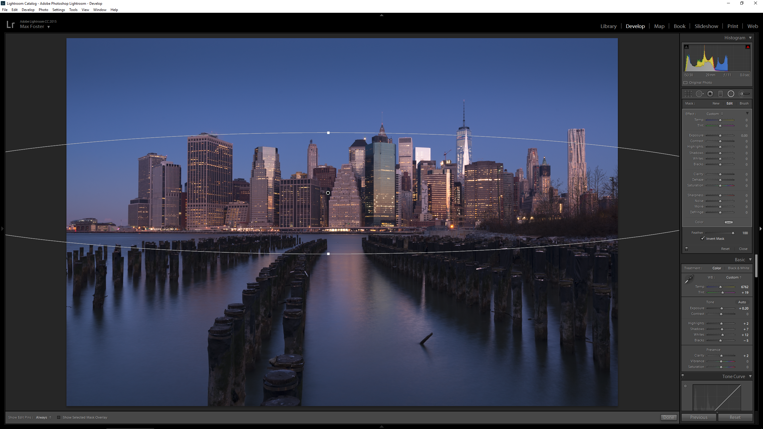
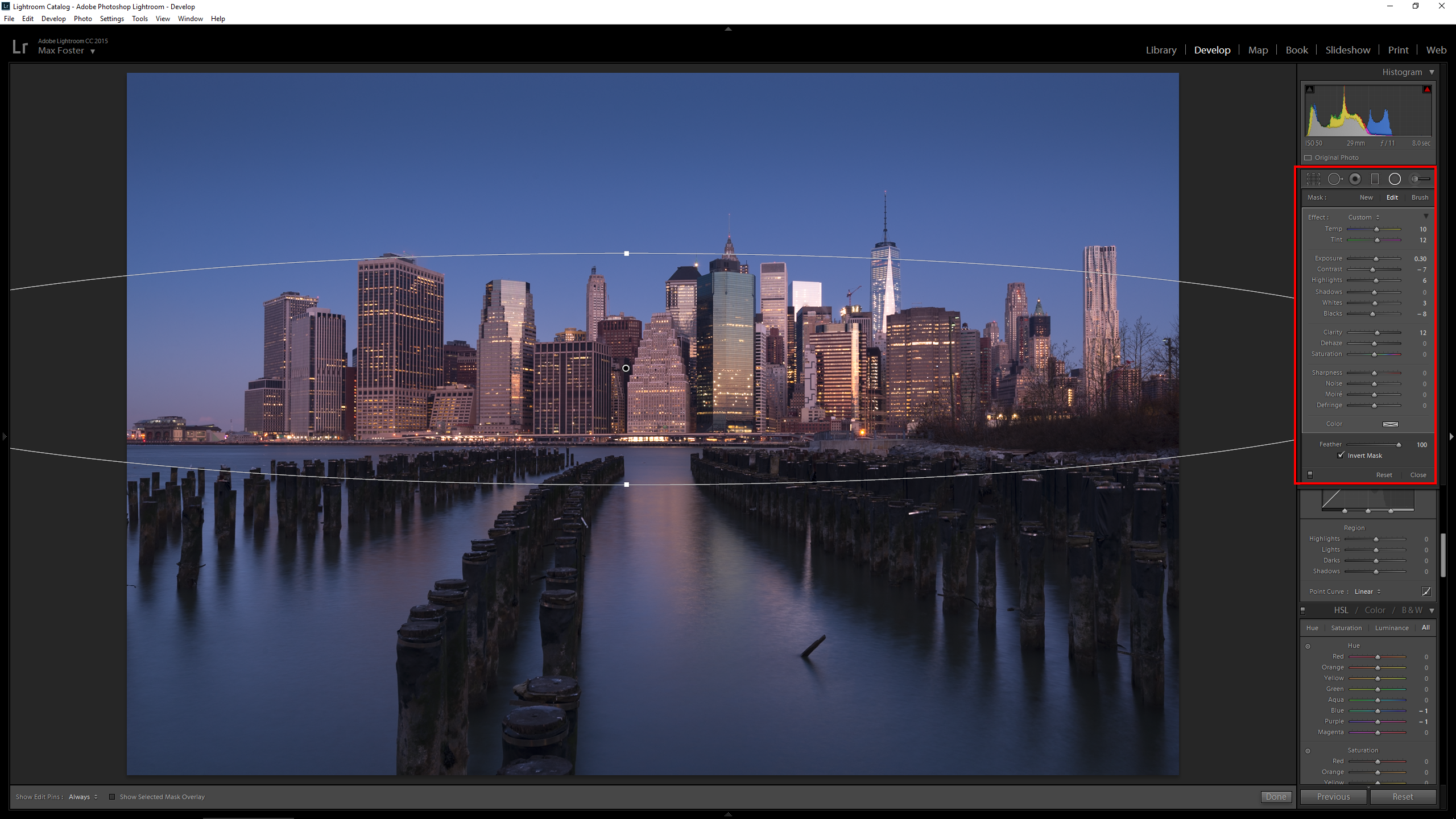
The graduated filter is great for adding broad effects, but sometimes you need an effect applied with different shapes. The radial filter is great for adding more punch to a sunburst, or highlighting an area of an image without impacting the edges like the graduated filter. In the example below, I wanted to increase the luminosity and contrast of the skyscrapers, as well as warm up the white balance. The radial filter was perfect for this, as I simply needed to create a long oval to overlay on the buildings without touching the sky or foreground.
Finally, the most versatile of the three is the adjustment brush. The brush can apply the same effects as the graduated and radial filters, except in any area you paint on. For example, you can create a large, soft brush to create a vignette, or a small hard brush to highlight a tree branch. In the image below, you can see the red mask for the brush strokes applied. I wanted to brighten the snow in certain areas to add more texture and depth to the image, so the brush tool was perfect.

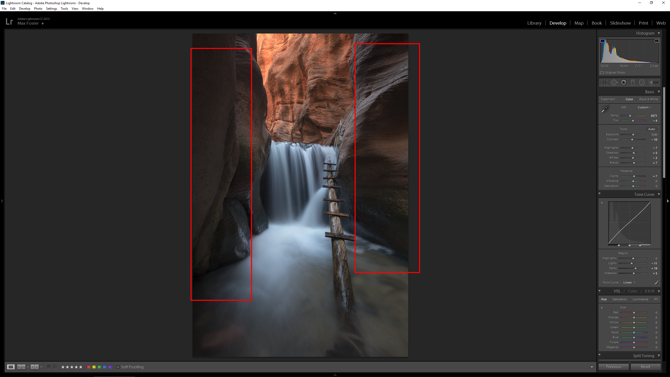
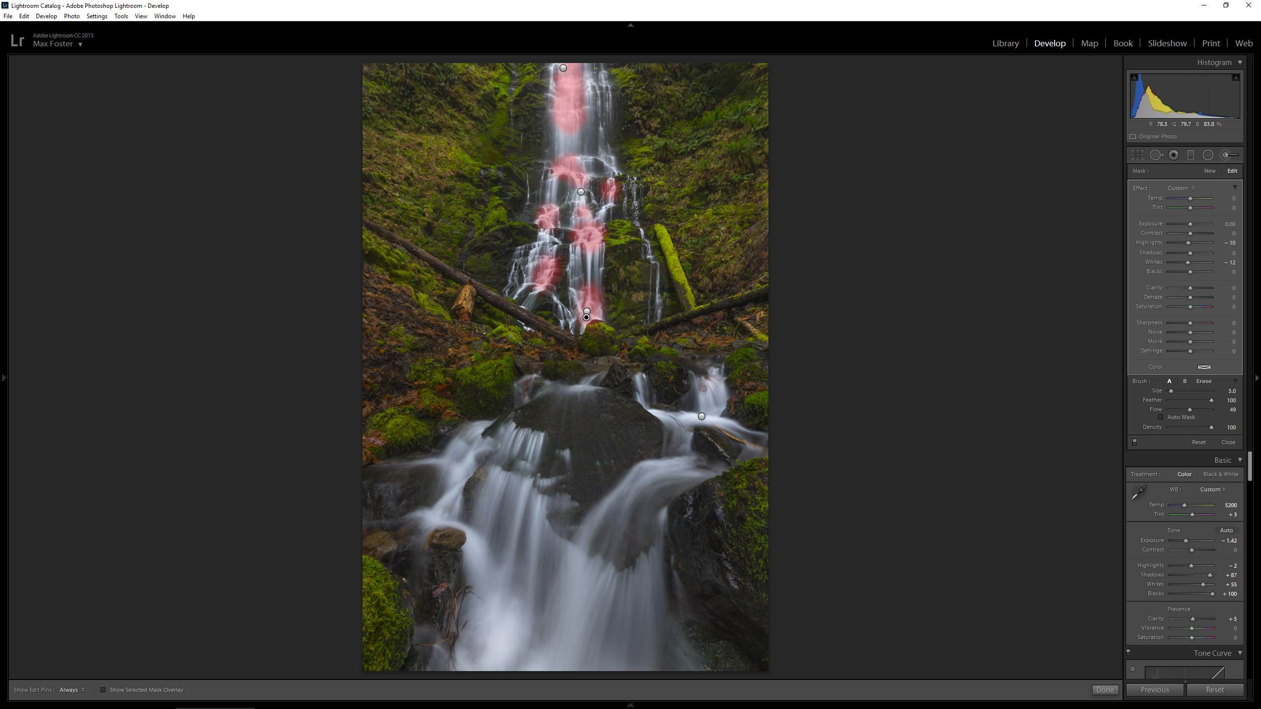
Another advantage of the brush tool is that you can correct highlight or shadow clipping caused by global adjustments earlier on. If you need to brighten an image and the highlights start to clip, you can then use the brush tool to reverse this. I like to decrease the highlights and/or whites in the brush tool and then paint on the brightest areas. In the waterfall below, the brightest areas of the water turned pure white, and I easily fixed this with a few strokes.
That concludes Part 2 of the RAW series! We have one more entry in the RAW series before moving on to the Artistic series in Photoshop. Thanks for reading!
I hope you enjoyed this tutorial, and find these tools to be helpful in your own workflow. You can find more tutorials on the RRS blog each month!